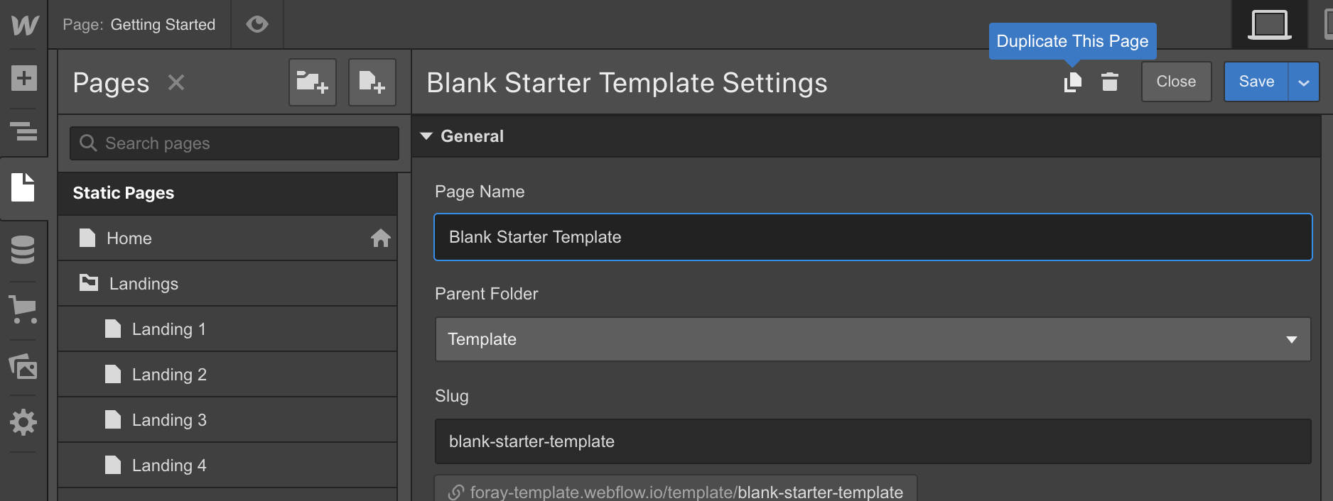
Blank Starter Template
Inside the "Template" directory, you'll find a page titled "Blank Starter Template". This template includes a navigation bar and a footer - the ideal starting point for your pages.
1. Duplicate the Blank Starter Page template

2. Copy and paste blocks to the newly created page:
Copy Sections from any page, then paste them into the body of your newly created page. Also you may copy sections from any page listed on the main landing page.
Style Guide
The Style Guide page demonstrates the display of all base elements found in the template and is a good place to start familiarising yourself with the template.
You'll also find a section demonstrating how to correctly use the associated utility classes.
Editing Typography Styles
Setting heading styles
Instead of using classes, you must click the header then in the Selector drop-down where you would type in the class name, select “All H1 Headings” then make your change. Same goes for all base heading elements. Click the element, choose “All heading 5”, then any changes you make to that will be reflected across all in the site.
Setting Body Text and paragraph styles
Follow the same procedure for body text and paragraphs - which are specified on the Body element. Select the body element, and from the Selector dropdown, choose “Body (All Pages)” and change the typography settings for that element. These styles then flow through to the paragraphs and other generic text elements in the site.
Grids
The template uses a horizontal grid of 8 columns to position elements. Add the class "Grid" to an element for format it as an 8 column grid, then use the "Column Span", or Manual position option to set the width of the element inside the grid.
The class reference for grids is as follows:
- Grid – this class will format the element as an 8 column grid.
- Rows - this class will set the grid layout so that children are structure in rows.
Modifier classes are as follows for the Rows class:
- Gap 0.75x - The gap between grid items will be 18px
- Gap 1.5x - The gap between grid items will be 36px
- Gap 2x - The gap between grid items will be 48px
- Gap 3x - The gap between grid items will be 72px
- Gap 4x - The gap between grid items will be 96px
- Gap 5x - The gap between grid items will be 120px
Back To Top Button
Ensure that the Back To Top Button symbol is the first element inside the body.

Then, ensure the page has a Page Scrolled interaction with the Hide Back To Top Button interaction activates when the page scrolls up, and the Show Back To Top Button interaction activates when the page scrolls down.

SVG Icons
Unfortunately Webflow does not allow dynamic coloring of SVG icons and dividers. To change the icon or divider color from the default:
- Download the icon SVG file
- Open the SVG file in a text editor
- Change the hex value to your desired color
- Save, and reupload the icon.
Disabling the Loading Animation
If you'd prefer not to use the loading animation:
- Remove the "Loader" symbol from the elements on the page.
- Remove both the "Load Page - 50%" and "Load Page - 100%" Page load interaction from the Interactions panel in the right-hand sidebar.
Custom Code
Inside the Project Settings, in the Custom Code tab you'll notice some style code has been added to the head of each page:

Font Rendering Custom Code
This code is to ensure that the text rendering is smooth and consistent across all browsers. It does not require any action on your part.
More Information
For further information, please consult the Webflow documentation or reach out to us via the Template Support Page.


